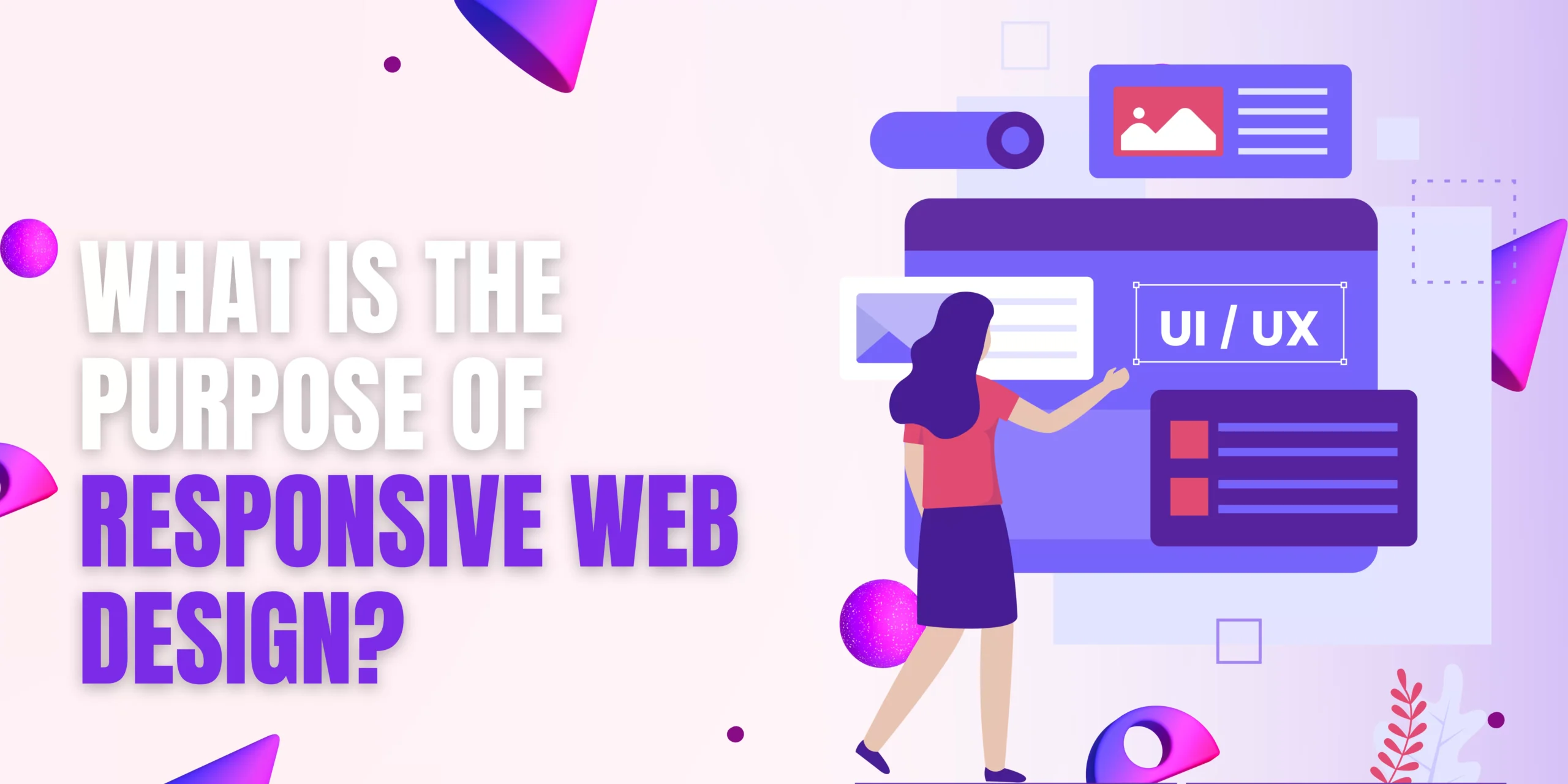
What is the purpose of responsive web design?
What is RWD?
Think of RWD as a website’s superpower. It can adapt its layout and content to any screen size, from desktop monsters to pocket-sized powerhouses. No more squinting, scrolling sideways, or pinching to zoom – just a seamless, optimal viewing experience for everyone, everywhere.
Why is RWD So Important?
The numbers speak for themselves:
- Over 50% of global web traffic comes from mobile devices.
- Users are 5 times more likely to abandon a site that’s not mobile-friendly.
- Google prioritizes mobile-friendly websites in search results.
In short, RWD isn’t just a nice-to-have, it’s a must-have. It’s about meeting your audience where they are and delivering a consistent, positive experience regardless of their device.
Beyond Mobile: The Benefits of RWD
RWD isn’t just about shrinking things down. It’s about rethinking how we design for the web. Here are some additional benefits:
- Improved SEO: As mentioned above, RWD websites rank higher in search results, boosting your online visibility.
- Reduced maintenance: No need to create and maintain separate desktop and mobile sites – RWD handles it all.
- Better user engagement: A smooth, frustration-free user experience keeps visitors coming back for more.
- Increased brand consistency: RWD ensures your brand message and image stay clear and consistent across all devices.
Ready to Embrace RWD?
Making the switch to RWD might seem daunting, but the rewards are well worth it. Here are some tips to get you started:
- Choose a flexible framework: Frameworks like Bootstrap and Foundation make RWD implementation easier and faster.
- Use responsive images and videos: Images and videos that adapt to different screen sizes ensure optimal viewing on all devices.
- Optimize your content: Keep text concise and easy to read on small screens.
- Test, test, test: Make sure your website looks and functions flawlessly on all devices and browsers.
The Future of Web Design is Responsive
As web design continues to evolve, RWD is no longer just a trend, it’s the new standard. By embracing RWD, you’re not just building a website, you’re building a bridge to connect with your audience in a meaningful and convenient way. So, flex your design muscles, unleash the power of RWD, and watch your website flourish in the ever-changing landscape of the web!
]]>